
Buttons represent actions the visitors can take with one click. Buttons link pages to each other in an easy and fashionable way.
Usage, Best Practice, and Accessibility
Examples
Button Group of Three with Images

Button Group of Four with Images

Button Group of Five with Intro Text
Usage
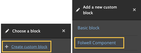
Step 1 - Selecting the Folwell Component
- After creating and publishing a page, click on the layout button. This will allow you to design and edit the layout of the page.

- Scroll down on the page and click on “Add Block”, and a navigation will pop up on the side. From there click “Create Custom Block” and then click “Folwell Component”.
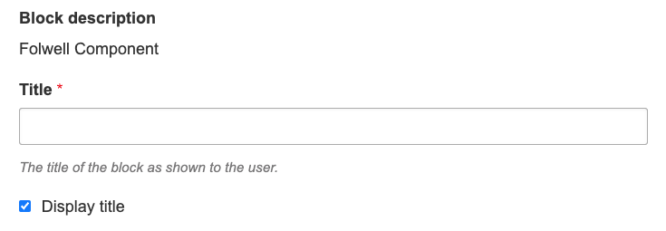
- From here add a title to the Folwell components, although you have the option to hide or display the title on the page.
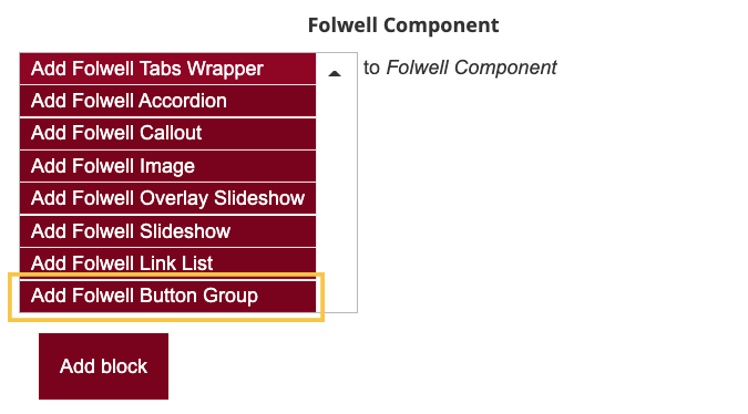
- Select “Add Folwell Button Group” as the Folwell Component you want to add from the dropdown list of components. From there select “Add block”.
- From here add a title to the Folwell components, although you have the option to hide or display the title on the page.
Step 2 - Customizing the Button
- In the “Intro Text” text area, add the text as an introduction for the button group. This is an optional field.
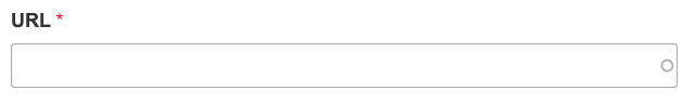
- In the “URL” text field, add the URL of the page you would like the button to link to. You are able to search for and link an already existing page on the website or add the URL of any other page you would like that button to link to.
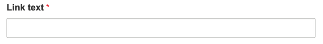
- In the "Link Text” text field, add the text you would like the button to say on the page.
- You are able to add an image to the associate with the button, but this is optional. Click the “Add Media” button if you want to add an image.

- From here you are able to scroll down and add a picture already uploaded on the website.
- Otherwise, you are able to upload a different picture from your computer by either dragging a picture into the gray box or clicking on the “Select File” button.
- If uploading a picture, Drupal will ask you to add alternative text, used for screen reader users. In this text box, describe the picture to the best of your ability.
- To add the picture to the button, select the “Save and Insert” button.
- Click the “Add Button Item” button to add a button to the group.

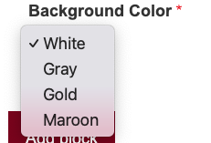
- Change the background color by clicking on the “Background color” dropdown box and choosing the color that best suits the page.
- After creating as many buttons in the button group, click the “Add Block” button. Note: the button group is limited to a maximum of 5 buttons per group.
Best Practices
- Buttons should be labeled descriptively, keeping the text as short as possible.
- The Image ratio is recommended to be 3:2, 675 pixels wide by 450 pixels tall.
About the button cluster design
- Button text will only wrap to two lines. Anything longer will get cut off.
- Buttons are designed to adjust to the tallest button in the button cluster.
Accessibility
- Avoid confusing button text like “click here”, “read more” and “more”.
- Avoid having more than one button linking to the same destination in the button group.
- Use different text for each button in the group.
- The contrast is high enough for background colors, fonts, and lines.
- The size is larger in order to make it easier for users with low coordination or on mobile devices.
- Button groups have an appropriate focus style.
- Button groups that have images require use of alt text.