Accordions are sometimes referred to as "drawers." They allow visitors to click on a header, which then expands or contracts to reveal or hide the content within a drawer. Accordions can aid in creating pages that are shorter and require less scrolling.
Usage, Best Practice, and Accessibility
Example
Accordion item
Inner heading 1
Synergistically network error-free platforms with customer directed scenarios. Competently extend.
Accordion item with inner responsive table
Inner heading
Synergistically network error-free platforms with customer directed scenarios. Competently extend.
| Inner | Responsive | Table |
|---|---|---|
| data | data | data |
| data | data | data |
| data | data | data |
Accordion item
Inner heading
Synergistically network error-free platforms with customer directed scenarios. Competently extend.
Add an Accordion
There are two options for adding a Folwell accordion to a page.
Option 1: Paragraph
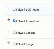
To use accordions on your pages, add a Paragraph field to your content type that includes the Folwell accordions paragraph type.
- Go to your content type (Structure > Content types > ”name of your content type” > Manage fields).
- On the Manage Fields tab click the Add field button.
- Add a new field type, Paragraph, in the label field write Accordion, and click the Save and continue button.
- On the next screen, click Save field settings.
- Under the reference type, click default as a reference method and select Folwell Accordion under paragraph types.
- Scroll down and click Save settings.
- Accordions should be available in your content type.
Adding accordion content
- Add content (for a new page: Content > Add content >”name of your content type” or for an existing page: Content > “name of your page”).
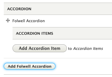
- Click the Add Folwell Accordion button.
- Click the Add Accordion Item button and follow numbered the instructions in the Layout Builder section below.
Option 2: Layout builder
Add an accordion using inline block in layout builder.
- Select the layout tab
- Select "Add Block" in the region where your accordion will be placed.
- Select "Create Custom Block" at the top of the sidebar.
- Select "Folwell Components" from the list of inline blocks.
- Select "Accordion" from the list of Folwell components and click "Add Block"
Add Accordion Items
Add the accordion item content.
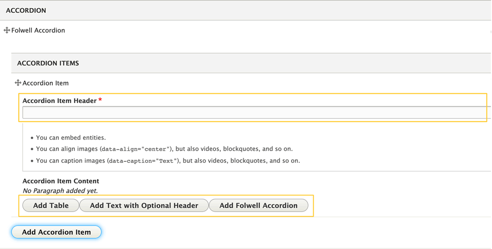
- Click “Add Accordion Item”
- Enter the title into Accordion Item Header. This is the text that will show when the accordion is collapsed and is required.
- Select one of the content options “Add Table,” “Add Text with Optional Header,” or “Add Folwell Accordion” and enter the content. This will appear when the accordion is expanded. Note: the “Add Folwell Accordion” function is not working; it's not currently possible to add an accordion within an accordion. Watch the Folwell Feedback page for updates.
- Add additional accordion items by clicking “Add Accordion Item."
Note:
- Accordion items can be reordered by clicking and dragging the crosshairs next to the “Accordion Item” label.
- With the current jQuery UI implementation, the trigger method is directly attached to H3s and they are reserved for the accordion drawer headings. Because of that, H3s shouldn't be used in the accordion content area and we recommend using H4s instead.
The Folwell accordions address the following usability issues:
- "+" and "x" symbols are used as a best practice to help visitors see they can expand the content.
- Based on usability testing, the "+" and "x" icons are placed on the left near the text.
- Don't use H3s in the accordion content area because they are reserved for the accordion drawer headings. It's recommended to use H4s.
Accordions should:
- Have a header for each drawer to indicate the content topic found in the drawer.
- Be clearly labeled so visitors can easily find the content they're looking for.
Use accordions when:
- Content needs to be on a page, but does not need to be displayed on page load.
- Visitors only need specific pieces of content.
- You only have a small vertical space to display information.
- There is enough content to condense.
- Content in the drawers is related and relevant.
Do not use accordions when:
- A visitor needs to consume all of the content to get your point or have their questions answered.
- A visitor needs to do a lot of scrolling to see all of the content within a drawer.
- The next drawer isn't readily visible to the visitor.
- You are concerned about cognitive load times.
A new page is needed if:
- Your page is extremely long. It would be best to rethink your navigation and consider creating shorter pages of content.
- An elaborate design is needed to support the content or clearly convey your point.
Folwell employs ARIA tags and tabbing to help ensure the visually impaired, using screen readers, can readily move between each accordion heading and open the sections of interest.
The following customizations have been implemented to make accordions that are fully accessible.
- An aria-label on the <div> to let the user know that they are dealing with an accordion. (The aria-label is set to 'Accordion Control Button Group').
- Each accordion header has a unique id associated with its aria-controls (each button controls this particular id which references the hidden content beneath it).
- Each header has an aria-expanded attribute on it that is toggled between true and false. If aria-expanded='true', the content associated with it is shown, and if 'false' the content is hidden. (All accordion headers have aria-expanded='false' to start).
- Every content area has an id that corresponds to the aria-controls for each header. It has an aria-hidden attribute that is toggled between true or false.
- A hover state has been applied so the visitor can see which drawer their mouse is on.


