Folwell is designed using the industry standard guidelines for web content accessibility which are organized around four principles: Perceivable, Operable, Understandable, and Robust (or POUR).
Folwell is tested during each phase of development. Below are summaries of what has been tested, as well as issues identified and recommendations taken for improvement. Ongoing usability reports from the lab will be posted here as they occur.
Winter 2019
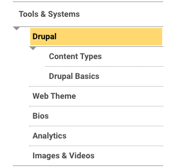
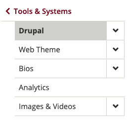
The main goal for this usability session was to test navigation. We wanted to know how the new left navigation will work in conjunction with the horizontal navigation on deep websites—something more than 4–5 levels deep. To test this, we recreated a portion of the Health Science Web Resource Hub on our theme.dev.umn.edu site and did comparative testing between the two sites.
Issues/Preferences and Recommendations
Issue—Nested menu items: Reaction to navigating through nested on-click horizontal menu items was mixed. Some found it frustrating, others had no issues.
Recommendation—Advise site builders to include three levels of links or fewer in the horizontal navigation. Advise site builders to consider a mega menu to allow site visitors to easily see all their options with fewer clicks.
Preference—Landing pages: Users liked seeing a landing page that included an outline of the child links for that section as well as a brief description of the content found on each page. Users also used breadcrumb links to navigate to landing pages.
Recommendation—To leverage Folwell breadcrumbs, promote usability, and enhance SEO, landing pages should be created for every page on a site.
Issue—Heading links: When users interacted with landing pages, they noted that the headings didn’t appear to be links as there was no visual cue, such as an underline.
Recommendation—Update the Folwell heading style to include a visual cue when the heading is a link.
Preference—When using the left navigation on the Health Sciences site, users were able to see the children links exposed when they went to a landing page. On landing pages using Folwell left navigation, users must expand the left nav to see the child links for that section.
Recommendation—Have the child links in the Folwell left navigation automatically expanded when on a landing page.
Spring 2018
The purpose of this usability session was to test the theme’s desktop and mobile navigation design and behavior against different types of navigation on other sites. Participants were asked to do the same tasks on various sites.
Issues/Preferences and Recommendations
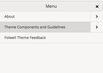
Issue—Some participants used their Android phone’s back button to get out of the full-screen mobile menu and back to the page they were on when they hit the menu link. Using the back button in this manner takes the user back to their previous page. It does not remove the menu, since the menu is not an actual web page.
Recommendation—Make the “X” on the menu more prominent.
Preference—Most participants preferred the off-canvas menu to menus that completely covered the screen, citing the ability to still have a sense of where they were on the site and easily move back to the page and away from the navigation.
Recommendation—The type of mobile menu being used for the Folwell site has been approved for usability and for OIT support. There are limits to the ways the menu can be configured. The off-canvas style for this menu presents some design and line length issues. The Folwell menu will remain a full-screen design, but will make the “X” icon more noticeable for people who want to close the menu and return to the page they were on.
Issue—Participants thought that tapping on mobile menu item texts (perhaps the ones that included the “>” icon) would give them sub-navigation choices instead of taking them to a page.
Recommendation—The approved menu style links to the page from the text and opens sub-navigation when the “>” icon is clicked. This is common behavior. The size of the “>” will be increased to help mitigate confusion.
Issue—The mobile menu is too gray and isn’t branded. The font is too small and hard to read.
Recommendation—Add brand elements to the menu. Increase the font size and make it darker.
Issue—Participants were not noticing the “>” buttons to go to the sub-navigation, or they didn’t understand how this feature works.
Recommendation—Make the “>” buttons more noticeable.
Preference—Almost all participants said they preferred a hover menu to an on-click menu. However, none of the participants were confused by the on-click style and none had problems completing their tasks with this type of menu. Two of the participants commented on how the hover menu items cover the page as you mouse around the navigation, but that the on-click doesn’t cover any part of the page until you click on it.
Recommendations—Continue to use the on-click style to address accessibility.
Winter 2017
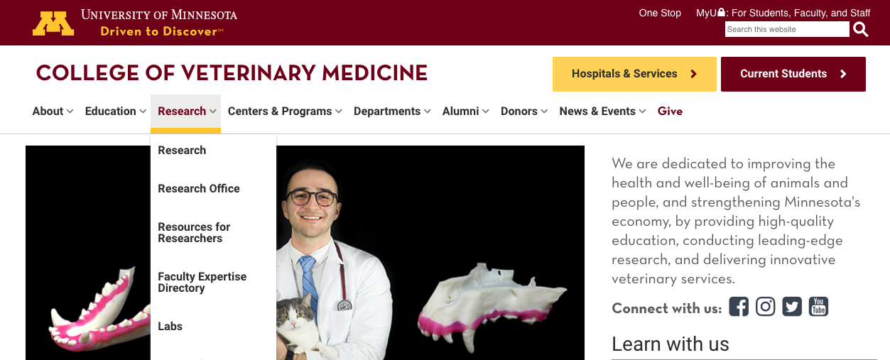
The purpose of this usability session was to test the same scenarios on two versions of the same site. A portion of the Veterinary Medicine site was copied and updated with Folwell theme elements. Tasks were designed to test navigation (both desktop and mobile), readability, and general appearance.
Issues and Recommendations
Issue—iPad navigation: Attempting to tap outside of the horizontal nav to clear the dropdown menu was unsuccessful.
Recommendation—Allow users to tap on another part of the screen to clear the menu. They should not have to choose a menu link.
Issue—Horizontal on-click dropdown navigation: Repetition of link name in the dropdown was confusing (e.g., “About Us” in the horizontal navigation bar and “About Us” in the dropdown).
Recommendation—When an index page for items in the main navigation is needed in the dropdown, use a slightly different link name. For example, use "About Us" in the navigation and "About the College" in the dropdown.
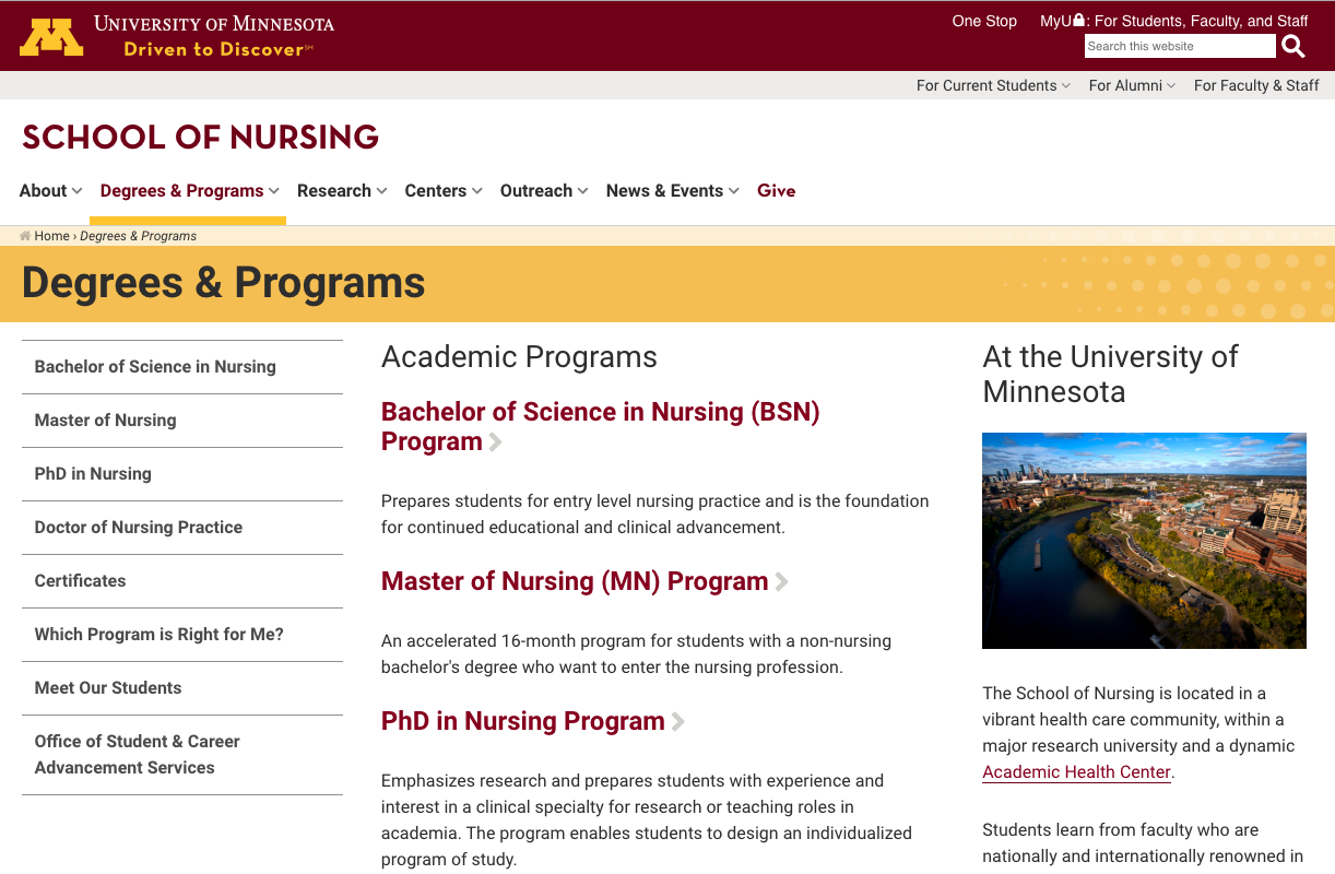
Issue—Secondary horizontal navigation: Participants didn’t see/use this navigation element on the nursing.umn.edu site.
Recommendation—Investigate best practices for secondary horizontal navigation and test various designs.
Issue—Mobile navigation: Participants didn’t notice the “+” symbol on the Folwell mobile nav or didn’t consider it to be something that would open sub-navigation options.
Recommendation—Consider using the “>” icon and/or switching to the sliding mobile navigation style used by the Nokomis theme.
Issue—Folwell color scheme: The VetMed site uses more maroon and gold than the version of the site with the Folwell theme. Participants commented that this made the site more lively and professional looking.
Recommendation—Use more color differentiation, and more color in general. Ensure the theme thoughtfully uses maroon and gold so any external visitor who visits any page on the site will be able to tell with ease that they are at the University of Minnesota.
Accessibility
Accessibility is a priority at the University of Minnesota. The standards, guidelines, and principles we followed to make all Folwell components usable and accessible come from the following:
- Web Content Accessibility Guidelines (WCAG)
- Accessible Rich Internet Applications (WAI-ARIA)
- Web Accessibility in Mind (WebAIM)
- W3C Web Accessibility Initiative (WAI)
With Folwell, the hard work has been done for you. Out of the box, the components are accessible and ready to be used.
