
This component allows you to include a Folwell themed footer on your site. A footer is the place a visitor goes to when they are lost on your site, are looking for contact information, or are looking for supplemental navigation on your site.
The University’s required footer includes the copyright, Equal Employment Opportunity (EEO) statement, and a privacy policy link. It will appear below your unit footer. Including this information within the unit footer is planned as a second phase for the unit footer component.
Usage, Best Practice, and Accessibility
Examples
Folwell offers five different variations of the unit footer and it’s been built with flexibility so you can easily display the content you need.
To add a unit footer block, follow the steps below. Drupal Lite users should follow these steps.
- Click on Extend in the Drupal menu bar.
- Filter for "folwell" and click on the checkbox to enable the Folwell Unit Footer module. Scroll down to the bottom of the page and click "Install." Note: You may need to install the Webforms module, if you haven't already. If you're prompted to install this module, Click "Continue" and filter for "webforms." Enable this module in the same way as the unit footer module.

- Go to Content, and select the "Blocks" tab.
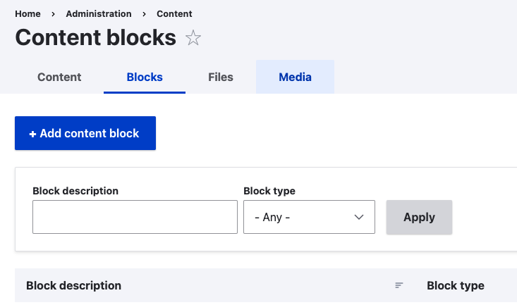
- Click “Add content block” and select “Unit Footer” block type from the list of custom blocks

- Select “Add Unit Footer: Full Width Title” to add a full width title to the unit footer.

- Fill out the department name and parent unit on the fields provided.

- Check “Include Top Gold Bar” checkbox if you want to add a top gold bar to the footer.
- Choose the footer background color under the “Footer Background Color” section.

- Select and add the number of columns you want to create, under the “Number of Columns” section.

- Under each column, you have an option to add the following paragraphs.

- Unit Footer: Button
Add the URL and link text to add a button to the column.

- Unit Footer: Wordmark
Add the wordmark title and image file to add wordmark to the first column. The wordmark should only be added to the first column or the far left column of the footer.

- Unit Footer: Text
This gives you the option to add text to the column. The text title is considered the heading for the section of content in the footer.

- Unit Footer: Links
Fill out the URL and link text field to add links to the column.

- Unit Footer: Contact
Fill out the address fields to add contact information to the column.

- Unit Footer: Social Media Links
Select the social media name from the “social media platform” dropdown and add the link to your social media channel/page.

- Drupal webform
This gives you the ability to embed any form that was built in the Drupal webform module. You can select the form from the “Webform” dropdown and embed it to your footer column.

- Save the custom block.
- Go to the “Block layout” page (structure > block layout) and place the unit footer block in Footer Bottom region

- Save blocks
- The unit/wordmark combination may be placed in the far left column of the footer. Consistent placement of this element, when used, will enhance user experience across our sites.
- The unit footer provides a consistent location and style, allowing University site visitors to quickly determine where to find common information such as contact information.
- The unit footer reinforces the University's brand in a precise, yet effective, manner while allowing units to customize information to their specific unit.
- Links to disclaimers and policy content is often placed in the footer. Be selective about including content that will give the impression of “disclaimer bloat.”
- When needed on a site, it’s recommended that Give buttons be included in the footer.
- Use plain language and a clear information hierarchy when adding text to the footer.
- Contact information should include social media channels that are regularly maintained as well as phone and email that are clickable
- links that can be dialed or emailed from a mobile device.
- The footer design has a proper contrast ratio.