
Vertical navigation is typically best as an addition to a large site that is using horizontal navigation for their main navigation. Combining vertical navigation with horizontal navigation on a site’s secondary pages may be particularly useful on sites that have deeply nested content. Guidelines and best practices are outlined in more detail in the "Best Practices" tab below.
Vertical navigation may also be used as the primary navigation instead of horizontal navigation if it better fits the site’s needs. Typically this works best when the site is shallow, usually no more than three levels deep.
Before you determine your site’s navigation style, please read through the Planning On-click Navigation information.
Example
See the vertical navigation on this page for an example.
- Enable vertical navigation
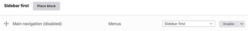
Go to the “Block layout” page (structure > block layout) and enable the “Vertical Navigation” block in the Sidebar first region.
- Configure the menu block.
- After you enable the vertical navigation menu block, click the configure button and do the following configurations.
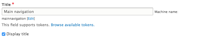
Check Display title check box.
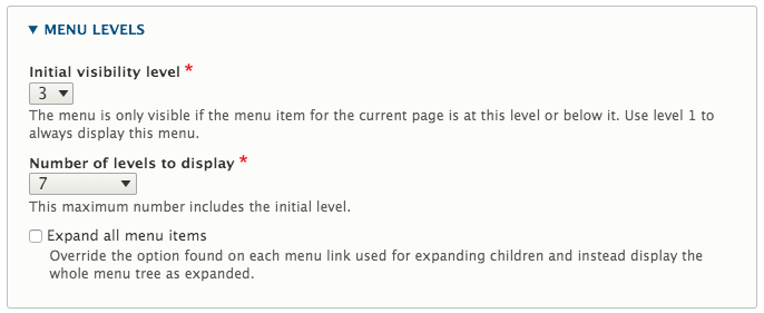
If you have a deeper navigation on your site, it is recommended you use the vertical navigation beginning at the third level. To set up you should select 3 for the initial visibility level and 7 for the number of levels to display, under the menu levels section.
- Under advanced options, select the following options:
Select Active trail’s parent title from Use as title dropdown.

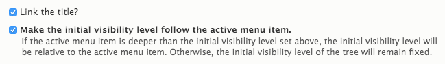
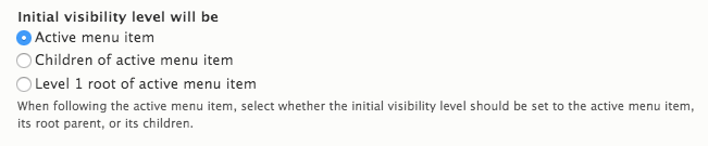
Check Link the title and Make the initial visibility level follow the active menu item check boxes.
Check Active menu item from Initial menu visibility level list.
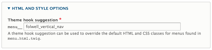
Under the HTML and style options section, add folwell_vertical_nav as a theme hook suggestion.
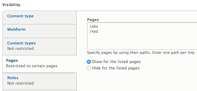
Under the Visibility section, click Pages tab and fill out pages this vertical navigation block should appear on.
- Save block
- Vertical navigation is recommended as secondary navigation.
- Place vertical navigation on the left side of your page, where users are accustomed to finding navigation.
- Be careful about menu length. Including more than three levels of nested links will make the vertical navigation longer and harder to use.
- Think about how your vertical navigation works in coordination with your horizontal navigation. When adding vertical navigation to a site, you may be able to minimize the number of levels you include in your horizontal navigation.
Guidelines for Use
- Three levels deep or more—When used in conjunction with the horizontal navigation, and following the horizontal navigation guidelines for use, vertical navigation should be added to sites that are more than three levels deep.
- Use of vertical navigation should begin on the third level of a site and continue to be used on all levels below that.

The menu is fully navigable with assistive software and uses ARIA markup. The following attributes have been added to the vertical navigation to enhance accessibility.
- The vertical navigation presents a site navigation and it is structured using the HTML5 element to allow users access to the menu directly.
- Aria-labelledby="IDREF" has been added to the menu wrapper to refer to the element that contains the accessibility name for the vertical nav.
- An invisible label has been added to the caret button to show the name of the parent menu item, reflecting the state of the submenu. The label for the caret button is provided by a visually hidden span element.
- Aria-haspopup has been added to the caret to indicate the button opens a menu.
- Aria-expanded=”true” has been added to the caret button to indicate that the menu is displayed and that activating the button closes the menu. The aria-attribute is removed when the menu is closed.
- The submenus use a down caret icon when opened.
As designed for the theme, the menu is fully responsive and meets all accessibility requirements including contrast checks, and tabbing and arrow navigation.