
Callout with photo
There are two options for adding Folwell callouts to a page.
Option 1: WYSIWYG (Folwell CKEditor)
Click the callout icon  in the WYSIWYG toolbar. A “Callout Style” window will appear with a variety of available options. Select the desired option and click OK.
Note: Callouts that include images currently cannot be configured in the WYSIWYG editor due to a bug in Drupal. Use the Paragraph option outlined below for callouts with images.
- Add a callout
- Callout styles:
- Grey Background - a basic callout with a light gray background color
- Gold Background - a basic callout with a gold background color
- Maroon Background - a basic callout with a maroon background color
- Gold Border - a callout with a gold border on all sides
- Gold Top Line - a callout with a gold top border
- Gold Left Line - a callout with a gold left border
- Callout Width: This determines the width of the callout. Available options are:
- Full - the full width of the content area
- 50% - half the width of the content area
- 33% - one third the width of the content area
- 20% - one fifth the width of the content area
- Callout Float: Select whether the callout should be aligned to the left or right side of the content area.
- Callout styles:
- A group of callout fields will appear. Add the header content to the header field and all other content to the text field.
Option 2: Paragraph
To use callouts on your pages, add a Paragraph field to your content type that includes the Folwell callouts paragraph type.
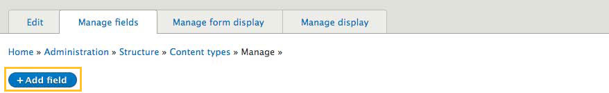
- Go to your content type (structure/content types/”name of your content type”).
- Under the Manage Fields tab click the Add field button.
Add a new field type, Paragraph, add the Callouts label, and click the “save and continue” button.

On the next screen, click Save field settings.

Under the reference type, click default as a reference method and select Folwell Callout under paragraph types.

- Click to save settings.
Go to your content type and click the Manage Display tab and change the default Callouts label to Hidden. (Note: this screen does not appear in Drupal Lite sites. Simply click "Save" on the screen that comes up and you will have enabled callouts.)

- Callouts should be available in your content type.
Adding callout content
- Add content (content/add content/”name of your content type”).
Click the Add Folwell Callout button.

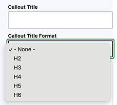
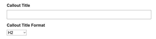
- Add Callout Title (optional). Select the appropriate heading level for callout title text. Although the default value is h2, you can use the Callout Title Format drop-down to select a different heading level when appropriate.
Add the Callout Image (optional). Browse existing images in the Media Library or upload a new image.

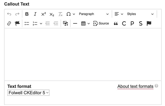
Add your Callout Text.

Choose the Callout Style:

- Grey Background - a basic callout with a light gray background color
- Gold Background - a basic callout with a gold background color
- Maroon Background - a basic callout with a maroon background color
- Gold Border - a callout with a gold border on all sides
- Gold Top Line - a callout with a gold top border
- Gold Left Line - a callout with a gold left border
- Horizontal Gold - a horizontal callout with a photo on the right and a gold callout background on the left.
- Horizontal Maroon - a horizontal callout with a photo on the right and a maroon callout background on the left.
- Overlay Gold Bar - a white callout area overlaying an image, positioned on the left side with a short gold bar at the top.
- Overlay Gold - a gold callout area overlaying an image, positioned on the left side.
Overlay Maroon- a maroon callout area overlaying an image, positioned on the left side.
Note: If you select Horizontal Maroon or Horizontal Gold Callout, the Horizontal Callout Text Position field appears directly below. This field allows you to choose the text position of the horizontal callout, either Left or Right.
- Choose a position:
- Middle
- Top Left
- Top Right
- Bottom Left
- Bottom Right
- Bottom
- Click the save button and the callout should be added to your page.
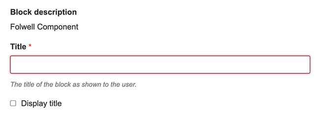
Option 3: Block
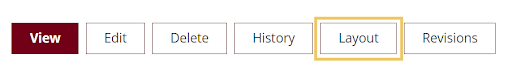
After creating a page, click on the layout button. This will allow you to edit the layout of the page
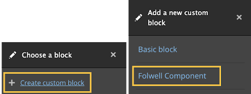
Scroll down on the page and click on the “Add Block” button and a navigation bar will pop up on the side. From there click “Create Custom Block” and then click “Folwell Component”.
From here add a title to the Folwell components, although you have the option to hide or display the title on the page.
- From the Folwell Component dropdown list, select "Add Folwell Callout".
Add Callout Title (optional). Select the appropriate heading level for callout title text. Although the default value is h2, you can use the Callout Title Format drop-down to select a different heading level when appropriate.
- Add the Callout Image (optional). Browse existing images in the Media Library or upload a new image.
Add your Callout Text.
Choose the Callout Style.

Note: If you select Horizontal Maroon or Horizontal Gold Callout, the Horizontal Callout Text Position field appears directly below. This field allows you to choose the text position of the horizontal callout, either Left or Right.
Choose a position:

- Click the save button and the callout should be added to your page.
- A callout should have a header and descriptive text that clearly explains its purpose.
- Callouts are placed near the content that the callout information is related to.
- Callout text is unique in your content. If a callout is removed, then the content is missing important information.
- Use headings that set clear expectations about the callout's purpose.
- Prioritize information so the most need-to-know information comes first.
- Limit the amount of text you put in a callout—the shorter it is, the more likely it will be read.
- Content should be concise and scannable.
- A callout may also include a clear call to action in the form of a link or button. To reduce confusion, avoid multiple call-to-action buttons or links.
- Choose a position and size for your overlay callout that does not obstruct important parts of your image (e.g., a face).
- The callouts, as designed for the Folwell theme, are fully accessible.
- Choose an image overlay color carefully. The color you use should complement your image colors.
- Be sure to use the appropriate heading tag for your callouts.