Form elements are used to collect data using input fields in a structured way.
Form elements used in Drupal 10 should be used with the Webform Module.
The Webform Module is very robust and offers many form element options. For the purposes of using it at the University of Minnesota, the display is customized to use Folwell styles and additional development work has been done to ensure accessibility based on a review of the module by the Disability Resource Center.
Status, warning, and error messages have been added to the form fields. To see the error messages, simply hit the submit button without filling any information.
Usage, Best Practice, and Accessibility
Example
The Drupal 10 webform module gives you the ability to create any form you want. To create a webform, follow the steps below.
Creating a webform
- Go to the form builder section under Structure > Webforms
- Click the add webform button.
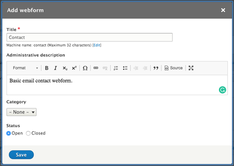
- The add webform window will open. Provide a title and administrative description to your new form and click save.
- After saving the add webform window, you will be redirected to the build section of your new form.
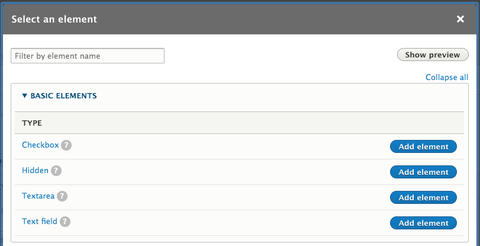
- Click the "add element" button under build tab to add any webform element.
- Select the webform element you want from the list of elements and click "add element" button on the right side of the box.
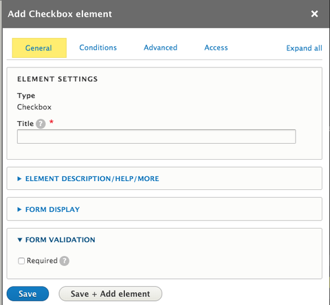
- Provide a title to the form element and make any additional configurations as needed.
- Click the "Save" button to add the form element to your form.
- You can view the form you’ve created by clicking the "View" tab, and also you can test your form with sample dummy text by clicking the "Test" tab.
Additional documentation regarding the webform module can be found on Drupal.org webform features page.
- Think through what information you need to gather, and how it needs to be organized and group similar types of information together.
- Arrange fields from easiest to most difficult. Visitors are less likely to abandon a form when they have already invested in filling it out.
- Minimize the number of form fields. The longer the form, the less likely the visitor will be to complete the form.
- Group fields logically and organize similar types of content together; for example, email, phone and address fields would be organized together under “Personal Information”.
- Include helper text to explain why a field is needed (e.g., how a phone number will be used).
- Break up the form into multiple screens or sections when it is a long form with multiple inputs. Display a progress bar to let the visitor know how many pages they can expect in the process.
- Test your form before launching. Testing can be focused in three key ways
- Usability - You want to ensure it works as intended.
- Speed - Time how long it takes to load and display the form.
- Time - How much time is needed to complete the form and how does it relate to the visitors expectations.
- A new style was added for status, warning, and error messages.
- When a single checkbox is needed, choose the single checkbox in the module. This will identify the checkbox as required and an aria-required="true" will be added to the fieldset.
- The description of a multiple email address element has been updated.
- Validation has been enabled to validate invalid entry.


