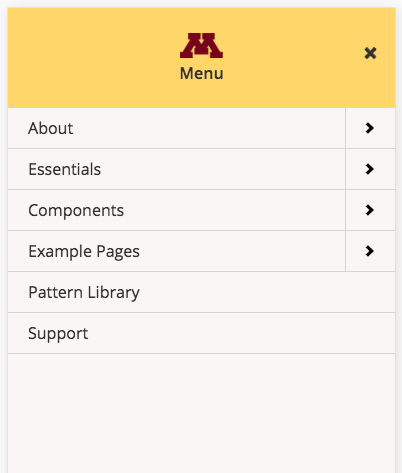
The mobile menu is set to display full screen by default and is branded with the block M.
Usage, Best Practice, and Accessibility
Example
The mobile menu works out of the box with Folwell's horizontal dropdown navigation; additional configuration is not needed.
The mobile menu has been tested in the usability lab. See Usability and Accessibility for the Spring 2018 test results.
The recommended use of the mobile menu is on-canvas, which is full screen. An off-canvas option is also available.
Good mobile navigation makes it easy for people to find what they need, without bogging down page speed or cluttering the screen.
When constructing your full screen menu, keep mobile in mind. Many of the same best practices apply, such as:
- Keep navigation link names short and sweet.
- List the most important pages first.
- Make your navigation intuitive.
The Folwell mobile navigation was constructed with these best practices in mind:
- Font sizes are readable on a small screen and colors have good contrast.
- Clickable elements were designed large enough for touch.
- Search, while not part of the navigation, is included as part of the mobile experience.
Folwell uses the M-Menu module for mobile navigation. It supports multiple menu levels with fly right or left items at deeper levels.
The mobile navigation module has default accessibility features and with an additional custom script partial to enhance accessibility.
The following customizations are included to make a fully accessible mobile menu:
- Aria-expanded—Indicates whether the element, or another grouping element it controls, is currently expanded or collapsed. An aria-expanded true/false attribute is added to each nested menu panel.
- Aria-haspopup—Indicates the availability of a submenu nested under the parent menu. Aria-haspopup toggles between true and false.
- Aria-hidden—Indicates whether the element is exposed. This property allows screen readers to see or ignore submenus depending on the focus it gets. Aria-hidden toggles between true and false.
- Aria-owns—This attribute establishes a parent/child relationship between the menu items in the accessibility layer.
- Aria-label—This attribute provides the text label for an object. The custom close button (X) includes “aria-label=close menu” and “aria-label=close submenu” is added to the go back button (<) on nested submenus. When a screen reader encounters the those buttons, the aria-label text is read so that the user will know what it is.
A close (X) button on the mobile navigation creates a visual indication and is labeled with aria-label to clarify what the button's purpose is.

