The horizontal on-click menu is recommended as the primary navigation style for all University websites. Consistent, widespread use of this navigation design means that University website visitors:
- will not have to learn a new navigation system when going from one unit’s site to the next
- will be able to quickly recognize and find the navigation by its consistent location and design
- will be able to use the navigation on any device
- will be able to more easily navigate your site, even if they have accessibility challenges
Site Planning with On-click
A number of things need to be considered when planning the navigation for a site using on-click navigation.
Determine Your Navigation Structure
Folwell currently offers on-click horizontal and vertical navigation options. We recommend choosing your navigation option(s) based on the depth of your site.
- Horizontal navigation only—Use this when your site is no more than 3 levels deep.
- Horizontal navigation without dropdowns—Use this on shallow sites along with vertical navigation.
- Horizontal navigation with full section-specific vertical navigation—Use this when your site is 3 to 5 levels deep.
- Horizontal navigation with partial section-specific vertical navigation—Use this when your site is more than 5 levels deep.
See the suggested guidelines for use of each of these options below.
Horizontal Navigation Only
As noted, the horizontal navigation is the recommended navigation for all University sites. Used effectively, this navigation should be no more than three levels deep.
- The top level of links along the visible navigation bar is your first level of links.
- Clicking on one of those top level links opens a dropdown menu with the second level of links.
- Clicking on a second level link opens a fly-out menu with the third level of links.
This is where you should stop with links in the horizontal navigation. If your site goes beyond three levels deep, you should accommodate the lower level links by using one of the options that includes vertical navigation.
See the Center for Animal Health and Food Safety for a 3-level horizontal menu example.
Horizontal Navigation Without Dropdowns
This is a good option for shallow sites when you want the vertical navigation to be the main navigation for the site.
- The horizontal navigation appears on all pages of the site and on click, each link in the navigation goes to a landing page.
- No dropdowns are included in the horizontal navigation.
- Includes all pages in the site, except for the home page.
- Depending on the size of the site, full site navigation may be used in the horizontal navigation.
- For sites that are no more than three levels deep, but have many pages on one or all levels, use the full section-specific method described below.
Full Section-specific Vertical Navigation
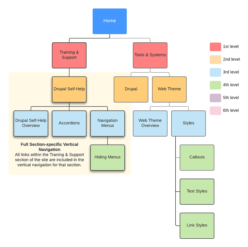
This option combines the horizontal navigation with vertical navigation for sites that are three to five levels deep.
Horizontal navigation can show up to the first three levels of pages in a site and is combined with a full vertical, section-specific menu on each lower level page. On a site that is four levels deep, the vertical navigation could begin to appear on second level pages and include the third and fourth level pages in the vertical navigation.
In the example below, the vertical navigation would begin on the Drupal Self-Help page and would include only the pages within that section. It would not include any pages in the Drupal or Web Theme sections.
Take care that the vertical navigation on sites that are three to five levels deep doesn’t become too long for the vertical navigation space. If you have a large number of pages on a shallow site, it might be best to consider the partial navigation option.
The illustration below shows how the second, third, and fourth level pages in this sitemap are included in the vertical navigation.
Partial Section-specific Vertical Navigation
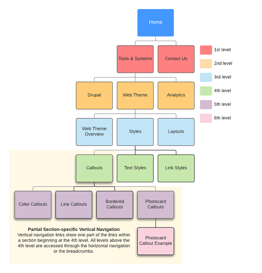
This option combines the horizontal navigation with vertical navigation for sites that are five or more levels deep.
Sites that are more than five levels deep cannot easily include all the links within a section in the vertical navigation. These sites should use the partial navigation solution available with Folwell vertical navigation. This allows sites to show just the navigation within the subpage section of the site.
In the illustration below, the vertical navigation would be placed on the Callout page and would include the fifth and sixth level pages within the Callout section. Visitors can still reach the first three levels of the site through the horizontal navigation as well as through the breadcrumbs.

