Tabs are used to organize similar groups of content to easily alternate between the related content.
Usage, Best Practice, and Accessibility
Example
See the Usage, Best Practice, and Accessibility tabs below for an example of the component and the information that was considered when developing the component.
There are two options for adding Folwell tabs to an enterprise Drupal page. The process for Drupal Lite sites is slightly different and is explained farther below.
Option 1: Paragraph
To use tabs on your pages, add a Paragraph field to the appropriate content type that includes the Folwell tabs wrapper paragraph type.
- Go to your content type (structure/content types/”name of your content type”).
- Under Manage Fields tab click Add field button.
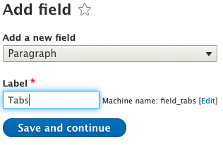
- Add a new field type, Paragraph, and add the Tabs label and click the “save and continue” button.
- Under reference type, click Default as a reference method and select Folwell Tabs Wrapper under paragraph types.
- Click to save settings.
- Go to your content type and click the Manage Display tab and change the default Tabs label to Hidden.
- Tabs should now be available in your content type.
Adding tab content
- Add content (content/add content/”name of your content type”).
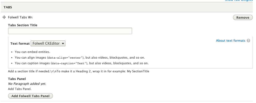
- Click the Add Folwell Tabs Wrapper button.
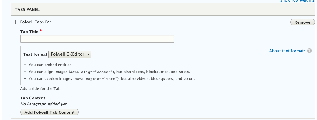
- Select Add Folwell Tabs Panel.
- Enter the Tab Title. This is displayed on the tab.
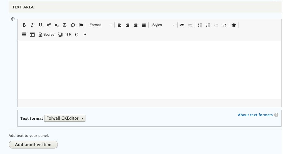
- Click the Add Folwell Tab Content button.
- Enter your Tab Content.
- Click the save button and Tabs should be added to your page.
Option 2: Layout Builder
You can add tabs in layout builder using an inline block.
- Go to your node and click the Layout button.
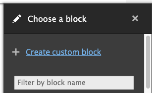
- Click the Add Block link on the layout section where you want to place the tabs.
- Under Choose a block, click Create custom block.
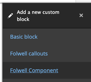
- Under Add a new custom block, click Folwell Component.
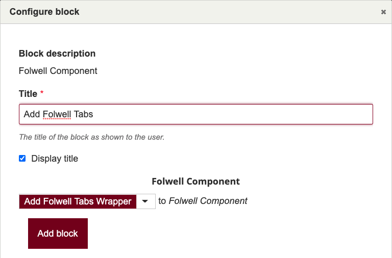
- Under the configure block modal window, choose add Folwell Tabs Wrapper from the Folwell components dropdown, and then click the Add block button.
- Tabs should be available to your block.
Drupal Lite
- Choose Add Folwell Tabs Wrapper from Folwell Components
- Include an optional Tabs Section Title. If used, this title will appear above your tabs on the site.
- Click on the Add Folwell Tabs Panel button to add your first tab.
- Give your tab a title, then click the Add Folwell Tab Content to add content to your tab.
- Add content to your tab. To make your second tab, click the Add Folwell Tabs Panel button.
- Repeat these steps until you have all the tabs and content that you need. Save your page to see the tabs.
- Content in your tabs should be within the same context. Do not use tabs as a replacement for multiple pages of different types of content.
- Clearly label your tabs so that your visitors know what to expect when they click.
- Use tabs only when users don't need to see content from multiple tabs simultaneously. If people need to compare the info presented on your page, they shouldn’t have to click through tabs to do that.
- Tab content should be parallel in nature and should not be positioned near the top of the page. If the tab labels are dissimilar, website visitors may interpret them as site navigation.
- Be careful to use just one row of tabs. As tabs shrink in size for mobile, they become an accordion.
As designed for the theme, tabs are fully responsive and meet all accessibility requirements including:
- contrast checks
- tabbing and arrow navigation
- aria roles and attributes
- highlighting applied to the open tab to help people see which tabbed content is displaying


