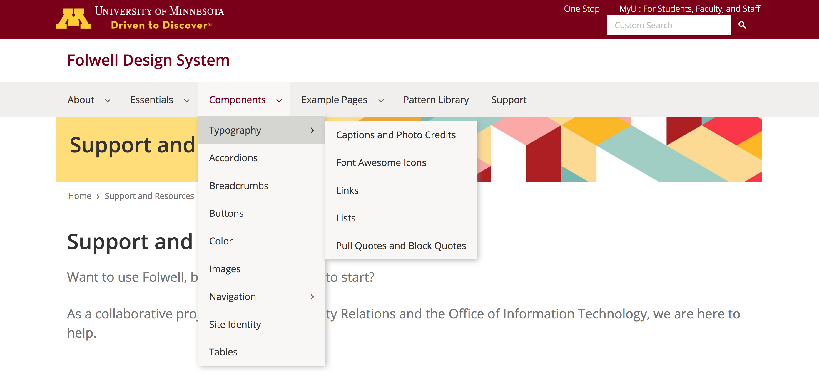
The horizontal dropdown menu is a compact way of displaying a list of links that take the visitor to another page of content within the same website.
Usage, Best Practice, and Accessibility
The horizontal dropdown menu is recommended as the primary navigation style for all University websites. Consistent, widespread use of this navigation design means that University website visitors:
- will not have to learn a new navigation system when going from one unit’s site to the next
- will be able to quickly recognize and find the navigation by its consistent location and design
- will be able to use the navigation on any device
- will be able to more easily navigate your site, even if they have accessibility challenges
Before you determine your site’s navigation style, please read through the Planning On-click Navigation information.
Example
For Drupal, the horizontal dropdown menu has been constructed using the Superfish module and is included out of the box with all new Drupal sites.
Menu Configuration
To find out how to include pages in your menu and how to add links to the horizontal navigation, see the Drupal Lite 8/9: Manage Menu Items instructions from the Drupal Lite Self Help Guide on the OIT site.
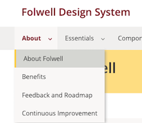
Note: If you want to include an index page for any link that opens a dropdown menu, include the index link as either the first or last choice in the dropdown and rename it (for accessibility purposes). For example, on this site the menu reads "About" and the menu dropdown includes a link to "About Folwell" in the dropdown.
- Units should choose to use a dropdown menu for sites that are shallow. It's best not to have more than three levels of dropdowns. One or two are preferred.
- Include a link to your site’s home page in either your main navigation or breadcrumbs, but not both. Recent studies confirm the need for both explicit (link labeled “Home”) and implicit (link from your logo) home links. See Homepage Links Remain a Necessity from Jacob Nielsen.
- Do not include a “Home” link on your home page.
- Navigation should always be positioned directly below your unit/site identity to promote consistency and usability across the U. Visually indicating—by using an arrow or triangle image—whether or not a navigation link will reveal a dropdown or mega menu when the user clicks it is a best practice.
- Dropdown or mega menu link order should be based on importance—the links your visitors use/need most frequently should be at the top of your list.
- If you want to include an index page for any link that opens a dropdown menu, include the index link as either the first or last choice in the dropdown and rename it (for accessibility purposes). For example, on this site the menu reads "About" and the menu dropdown includes a link to "About Folwell" in the dropdown.
The on-click is the University's preferred menu behavior, since it addresses usability and accessibility concerns.
As designed for the theme, the dropdown menu is fully responsive and meets all accessibility requirements, including:
- contrast checks
- tabbing and arrow navigation
- aria roles and attributes
The following code and customizations for accessibility are included in Drupal for the Folwell horizontal navigation:
- The default hover behavior is changed to "onclick."
- role="navigation" and aria-label="main menu" added to the main superfish div/nav.
- role="menu item" is added to each list item, including those on the menubar, in dropdown menus, and in submenus.
- role="menubar" is added to the root < ul >.
- aria-haspopup and aria-expanded attributes are added to the menu with child submenus. aria-haspopup=”true” indicates to the screen reader that the button opens a menu. aria-expanded=”true” is added when the menu is open.


