Buttons represent actions the visitors can take with one click.
Usage, Best Practice, and Accessibility
Examples
Small Button Regular Button Emphasis Button
Usage
- Highlight the text to be linked in the WYSIWYG.
- Click the link icon
 in the WYSIWYG toolbar and enter the url to link the content.
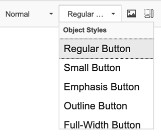
 - Change link to a button. With the link text highlighted, select one of the following button styles from the Styles dropdown menu in the WYSIWYG toolbar.
Note: It's currently not possible to add a button to a callout. This has been reported as a bug.
Best Practice
- Folwell uses maroon buttons with mouseover and pressed states.
- Buttons should be labeled descriptively, keeping the text as short as possible.
- A maroon button with a gold border may be used to draw attention to something special on your site; for example, an opportunity to "Give."
- Buttons are offered in two sizes—small and regular—and both sizes have been designed to provide an ample touch target for mobile. The small button is best used in the site identity space in the header, for example.
Accessibility
- The buttons use HTML for the text on the button, making them accessible.
- The mouseover style helps indicate that the button is a link.

