Folwell offers two full-width horizontal slideshow options.
Usage, Best Practice, and Accessibility
Consider the user experience research before choosing a slideshow:
- Studies have shown that people look at and take action only on the first slide. If you do want them to look at more than one slide, make the first slide interesting or useful. The first slide has to sell the next slide to the user.
- Eye tracking tests show that slideshows get little attention by website users.
- Improper header tags, slow page load due to high bandwidth images or videos, or lack of alternative image tags can have a negative impact on your website’s SEO and user experience.
- In theory, a slideshow should entice a user to take an action or otherwise become informed about a website goal or mission. But studies show that slideshows can actually decrease conversion rates due to the frustration of use.
"I’d hate to label all carousels as liabilities, but they also don’t belong on most websites. They can work but not as well as static hero images or thumbnail galleries.
Stick to carousels only for the purpose of showcasing visuals or slideshows. Anything more than that is a disservice to the user experience and likely won’t push visitors any further into your site."
Jake Rocheleau, "Design Debate: Are Image Carousels UX Assets or Liabilities?," Envato Blog
Examples
Simple Slideshow
Overlay Slideshow
Slideshow paragraph type can be added to Paragraphs or Layout Builder through a Content Type. It is up to your development team as to what the preferred process will be for the site you are working on.
The instructions below are how to build a slideshow once it’s been set up on your site.
Add a Folwell Slideshow
The Folwell Slideshow features photos and content side by side. Content is on a gold background that is 40% of the slideshow width.
- Click the Add Folwell Slideshow button in the Node Edit screen.
- Add the slideshow header. This text will appear above the slideshow and should be added if applicable.
- Add slides.Click the “Add Slide” button.
This will display a number of fields related to this slide.
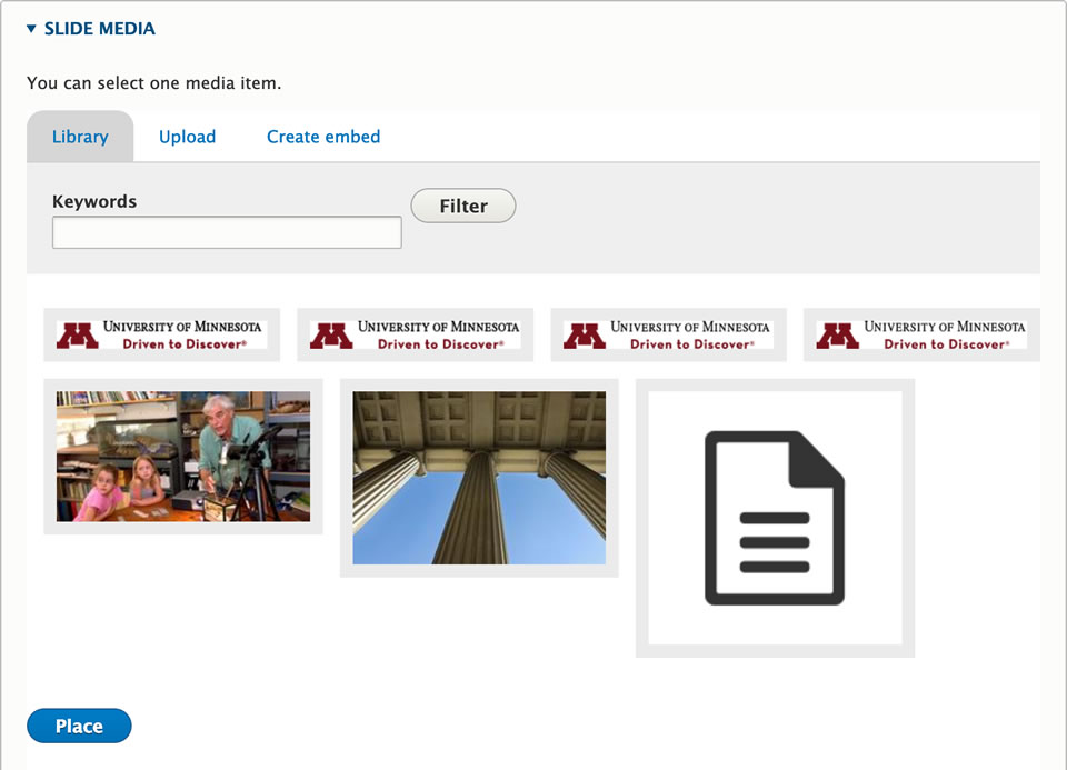
- Add slide media. Select an image from the Media Library or upload a new one. See “Adding Images” for more detail.
- Enter slide header. This is the title for the slide. It will be displayed as an h2 heading.
- Enter slide content.

- Background color. Select a background option of gold, gray, or maroon from the background color dropdown list.
- Enter slide link. This will add a link to the specific slide. Currently this feature is not working.
- Add additional slides. Click the “Add Slide” button to add additional slides.
- Remove slides. Click the “Remove” button to the right of the slide label.
- Reorder slides. Click and drag the crosshairs to the left of the slide label to reorder the slides. Given the size of the slide fields it can sometimes be difficult to drag slides to reorder. Another way to accomplish this is to click the “Show row weights” link and change the numbers corresponding to each slide. This will reorder them as well
Add a Folwell Overlay Slideshow
The Folwell Overlay Slideshow features full width photos with slide content in a gold overlay box.
- Click the Add Folwell Overlay Slideshow button in the Node Edit screen.
- Add the Slideshow Header. This text will appear above the slideshow and should be added if applicable.
- Add Slide Image. Choose Browse Media or Add media to select an existing image from the Media Library or upload a new one. See “Adding Images” for more detail.
Note: It is recommended to select images that are wide enough for the slideshow and consistent in height. - Enter Overlay Header. This is the title for the slide. It will be displayed in the overlay area.
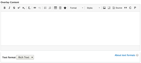
- Enter Overlay Content. This content will be displayed in the overlay area.
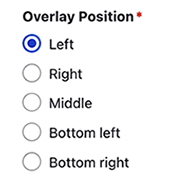
- Select Overlay Position. This will place the overlay on the left, right, middle, bottom left, or bottom right side of the slide.

- Background color. Select a background option of gold, gray, or maroon from the background color dropdown list.
- Add Additional Slides. Click the “Add Overlay Slide” button to add additional slides. Fill out the fields for each additional slide.
- Remove overlay slides. Click the “Remove” button to the right of the slide label.
- Reorder overlay slides. Click and drag the crosshairs to the left of the slide label to reorder the slides. Given the size of the slide fields it can sometimes be difficult to drag slides to reorder. Another way to accomplish this is to click the “Show row weights” link and change the numbers corresponding to each slide. This will reorder them as well
Slideshow recommendations:
- Landscape-oriented images are recommended.
- Consider the composition of your images when using a slideshow with a text box on top of the image.
- Make sure your images are a consistent size and quality.
- High-resolution images take a considerable amount of time to load - it is best to optimize them for the web.
- Set up event tracking in Google Analytics to track clicks per slide to determine how your slideshow is performing.
Slideshows should:
- Provide your visitor with the ability to stop, start, and advance the slides on desktop, keyboard, and touch screens.
- Limit the number of slides and make sure load time is fast.
- Keep text short.
- Address the needs of your content strategy.
Use slideshows when:
- The type of content fits with slideshow use. Good uses for a slideshow are:
- an image galleryan online portfolio
- a product (campus or program) tour
- telling of a story.
- You need to present a number of related things in a way that doesn't take up too much space.
- You've consulted this website.
Do not use slideshows when:
- You are addressing a business (internal) need rather than the needs of your site's visitors.
- They could create distraction and confusion by not fulfilling your visitor's needs.
Alternatives to using slideshows:
- Static hero image - Consider using one single photo with some text and maybe a call to action. Hero images provide a better user experience since they stay fixed and don't use any animation.
- New static hero images displayed on pageload - You could select 3 or 4 compelling hero images and set it up so that a new hero image is displayed upon page load. This would present different content to your visitors during each visit.
- Image grids - a image grids allows you to include more visuals without adding a slideshow.
- Engaging video - The use of the video should be intentional and it should add some depth or voice to your site that a single image would not be able to deliver. There are accessibility considerations that should be taken into account when using video on your site.
- Slideshows should not move automatically.
- A slideshow’s design and frequent movement can make people think it’s an ad, leading them to ignore it.
- Moving elements can negatively impact accessibility, especially for those with motor skill issues.
- Many people can have a hard time reading all the text before a slider advances.
- Dot navigation below the slideshow, as well as arrow navigation on the sides of the slideshow, allows your web visitors to move through the slides at their own pace.
- The slideshows, as designed for the Folwell theme, are fully accessible.


