Callout with photo
There are two options for adding Folwell callouts to a page.
Option 1: WYSIWYG (Folwell CKEditor)
Click the callout icon ![]() in the WYSIWYG toolbar. A “Callout Style” window will appear with a variety of available options. Select the desired option and click OK.
in the WYSIWYG toolbar. A “Callout Style” window will appear with a variety of available options. Select the desired option and click OK.
Note: Callouts that include images currently cannot be configured in the WYSIWYG editor due to a bug in Drupal. Use the Paragraph option outlined below for callouts with images.
- Add a callout
- Callout styles:
- Grey Background - a basic callout with a light gray background color
- Gold Background - a basic callout with a gold background color
- Maroon Background - a basic callout with a maroon background color
- Gold Border - a callout with a gold border on all sides
- Gold Top Line - a callout with a gold top border
- Gold Left Line - a callout with a gold left border
- Callout Width: This determines the width of the callout. Available options are:
- Full - the full width of the content area
- 50% - half the width of the content area
- 33% - one third the width of the content area
- 20% - one fifth the width of the content area
- Callout Float: Select whether the callout should be aligned to the left or right side of the content area.
- Callout styles:
- A group of callout fields will appear. Add the header content to the header field and all other content to the text field.
Option 2: Paragraph
To use callouts on your pages, add a Paragraph field to your content type that includes the Folwell callouts paragraph type.
- Go to your content type (structure/content types/”name of your content type”).
- Under the Manage Fields tab click the Add field button.

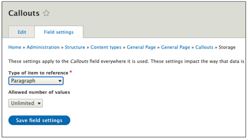
- Add a new field type, Paragraph, add the Callouts label, and click the “save and continue” button.
- On the next screen, click Save field settings.
- Under the reference type, click default as a reference method and select Folwell Callout under paragraph types.
- Click to save settings.
- Go to your content type and click the Manage Display tab and change the default Callouts label to Hidden. (Note: this screen does not appear in Drupal Lite sites. Simply click "Save" on the screen that comes up and you will have enabled callouts.)
- Callouts should be available in your content type.
Adding callout content
- Add content (content/add content/”name of your content type”).
- Click the Add Folwell Callout button.
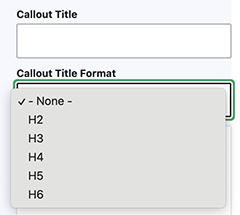
- Add Callout Title (optional). Select the appropriate heading level for callout title text. Although the default value is h2, you can use the Callout Title Format drop-down to select a different heading level when appropriate.
- Add the Callout Image (optional). Browse existing images in the Media Library or upload a new image.
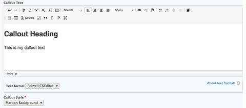
- Add your Callout Text.
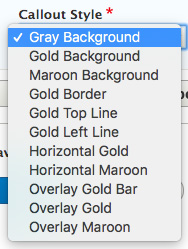
- Choose the Callout Style:
- Grey Background - a basic callout with a light gray background color
- Gold Background - a basic callout with a gold background color
- Maroon Background - a basic callout with a maroon background color
- Gold Border - a callout with a gold border on all sides
- Gold Top Line - a callout with a gold top border
- Gold Left Line - a callout with a gold left border
- Horizontal Gold - a horizontal callout with a photo on the right and a gold callout background on the left.
- Horizontal Maroon - a horizontal callout with a photo on the right and a maroon callout background on the left.
- Overlay Gold Bar - a white callout area overlaying an image, positioned on the left side with a short gold bar at the top.
- Overlay Gold - a gold callout area overlaying an image, positioned on the left side.
- Overlay Maroon- a maroon callout area overlaying an image, positioned on the left side.
- Click the save button and the callout should be added to your page.
Option 3: Block
-
After creating a page, click on the layout button. This will allow you to edit the layout of the page

-
Scroll down on the page and click on the “Add Block” button and a navigation bar will pop up on the side. From there click “Create Custom Block” and then click “Folwell Component”.
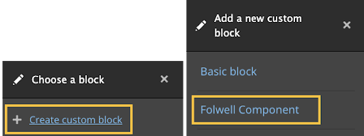
-
From here add a title to the Folwell components, although you have the option to hide or display the title on the page.
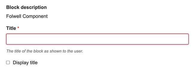
- From the Folwell Component dropdown list, select "Add Folwell Callout".
-
Add Callout Title (optional). Select the appropriate heading level for callout title text. Although the default value is h2, you can use the Callout Title Format drop-down to select a different heading level when appropriate.

- Add the Callout Image (optional). Browse existing images in the Media Library or upload a new image.
-
Add your Callout Text.
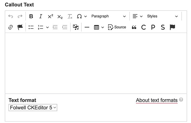
-
Choose the Callout Style.
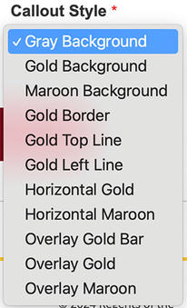
- Click the save button and the callout should be added to your page.
- A callout should have a header and descriptive text that clearly explains its purpose.
- Callouts are placed near the content that the callout information is related to.
- Callout text is unique in your content. If a callout is removed, then the content is missing important information.
- Use headings that set clear expectations about the callout's purpose.
- Prioritize information so the most need-to-know information comes first.
- Limit the amount of text you put in a callout—the shorter it is, the more likely it will be read.
- Content should be concise and scannable.
- A callout may also include a clear call to action in the form of a link or button. To reduce confusion, avoid multiple call-to-action buttons or links.
- Choose a position and size for your overlay callout that does not obstruct important parts of your image (e.g., a face).
- The callouts, as designed for the Folwell theme, are fully accessible.
- Choose an image overlay color carefully. The color you use should complement your image colors.
- Be sure to use the appropriate heading tag for your callouts.


